Need the specifics upfront
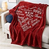
In the middle of the description for what looks like a nice blanket are the words "distressed font," which correlate to 6 of the 21 names looking like they did not get enough ink in the process of the blanket being made. I was very disappointed in the look of this blanket, which I bought for my 80-year-old father, who would want all of his grandchildren's names to appear the same and not have some of them appear shoddy. Upon calling Customer Service, I was told that that is what the product should look like and they could offer me a 30% discount on another blanket that would have all the names appear in the same manner. The odd font should be at the top of the description of this blanket so that nobody else ends up with such a low quality product. You'd have to really enlarge the picture of what the product looks like in order to see the discrepancy between what you think you're getting and what you really get




 NFL
 NCAA Gifts
 MLB
 Callaway
 Carhartt
 Vera Bradley
 USA 250th
 Reduce
 Melissa & Doug
 Lenox
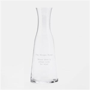 Luigi Bormioli
 philoSophie's®
 Precious Moments
 Custom The Elf on the Shelf Gifts
 Loading cart contents...